Amor Fati: love your fateIn my philosophy class this semester, we studied and discussed extensively the concept of Amor Fati, or love for one's fate; to be an active player in ones' destiny, and a man or woman of ones' generation. These discussions and lessons expanded my understanding of what I wanted to achieve academically and in my livelihood.
|
Philosophy
The following is the culmination of my research into the esteemed 20th century philosopher, Ludwig Wittgenstein, his life, and his detailed epistemology, especially his philosophical studies into linguistic analysis.
Publications
Final Project Prototype
The production of my prototype as a pre-meditation to our final projects resulted in almost a complete redirection in my project vision. Originally, I was thinking about some medieval revival style illumination on vellum, but now, after rekindling my love of simple watercolors, I’m thinking about a different path.
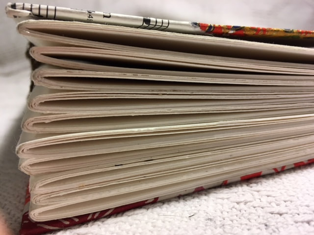
The Signatures:
The 10 signatures that make up the body of the book are sheets of leftover watercolor paper from my AP Studio art days. Each signature is comprised of three sheets. I’m satisfied with the size of the sheets (11’x18’), and I think I’ll be taking this detail to my final copy.
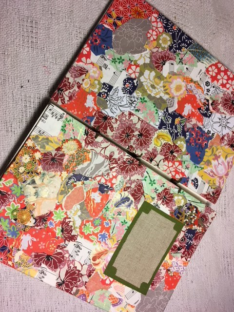
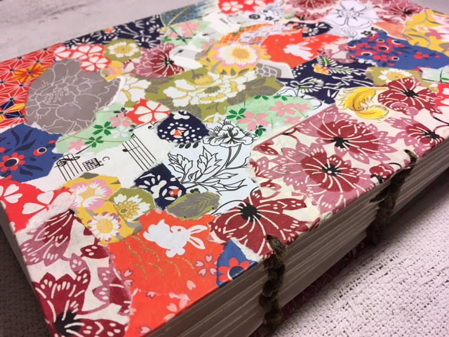
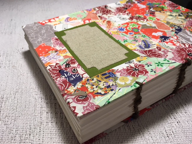
The Covers:
The covers of the book are where things started to look tricky and amateur. My collage work was such a fun and refreshing project when I was really needing an artistic boost. However, the leftover cardboard that was used to adhere the colorful paper scraps to began to warp quickly after it was glued. Definitely in need of revision.
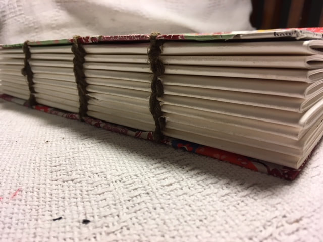
The Stitches:
I couldn’t find my waxed thread anywhere! Although distressed, I was only slightly deterred, but had to resort to using thick, cumbersome, and chunky brown sail twine from my dad’s sailboat workshop. It was hard to sew with, left ugly poopy looking streaks on the pages and… it’s just a mess.
Irregardless, I used the twine to produce some haphazard Coptic stitches with three holes made with an awl on each signature. Definitely need to sharpen up my Coptic stitch skills. (Perhaps find a more comprehensive tutorial?)
Anyhow…
I’m overall satisfied, and I know what I’m taking from this experience to the final. Now, though, I’m thinking of taking a more simplistic approach to producing a quality coptic bound book.
The Signatures:
The 10 signatures that make up the body of the book are sheets of leftover watercolor paper from my AP Studio art days. Each signature is comprised of three sheets. I’m satisfied with the size of the sheets (11’x18’), and I think I’ll be taking this detail to my final copy.
The Covers:
The covers of the book are where things started to look tricky and amateur. My collage work was such a fun and refreshing project when I was really needing an artistic boost. However, the leftover cardboard that was used to adhere the colorful paper scraps to began to warp quickly after it was glued. Definitely in need of revision.
The Stitches:
I couldn’t find my waxed thread anywhere! Although distressed, I was only slightly deterred, but had to resort to using thick, cumbersome, and chunky brown sail twine from my dad’s sailboat workshop. It was hard to sew with, left ugly poopy looking streaks on the pages and… it’s just a mess.
Irregardless, I used the twine to produce some haphazard Coptic stitches with three holes made with an awl on each signature. Definitely need to sharpen up my Coptic stitch skills. (Perhaps find a more comprehensive tutorial?)
Anyhow…
I’m overall satisfied, and I know what I’m taking from this experience to the final. Now, though, I’m thinking of taking a more simplistic approach to producing a quality coptic bound book.
- Instead of using cardboard, I’m going to use thin wood sheets cut to specifications.
- I’m going to have my content be a printed and artistically rendered edition of the Tao Te Ching, by Lao Tze, complete with watercolor illustrations.
- The cover will be an eastern influenced design, rendered with a wood-burning tool, and sealed with polyurethane. I’ve done this before with a box-guitar body that I made some time ago.
Final Project:
|
For my final assignment, I decided to make an artistic rendition and printed/bound copy of a book I was introduced to in Philosophy class, the Tao Te Ching, by Lao Tze.
The idea came from the fact that ever since my academic life became accelerated around age ~15, I've wanted very much to slow down and explore a text intimately and personally the way that I did when I was a young one, living in the books' worlds I explored. |
|
My Process-
The edition of the Tao Te Ching from which I acquired my source material was that of Project Gutenberg (https://www.gutenberg.org/files/216/216-h/216-h.htm)
I downloaded the text from their extensive archive, and imported it into InDesign.
Now, the thoughts on the entire text layout was made with the knowledge that it would subsequently be filled with hand-illustrations prior to being printed on 11x17 dimension paper.
Originally, I had wanted to go with watercolor designs, and have the text printed on suitable watercolor paper. However, watercolor paper is prone to warping, which I could foresee causing a lot of problems and taking a lot of my time, so I elected to alternately use practical and readily available card stock.
I had an absolute blast illustrating these pages. I can spend absolutely hours upon hours painting, drawing, and illustrating, and never notice the hours are gone.
Now, the illustrations were already predestined for certain pages, after I had read and created space in my InDesign document for all of them.
All I had to do then was create them.
The Tao Te Ching mainly explores meditative and philosophical themes in connection to nature, modesty, and wisdom in all things. It was at the time of its creation, as it is now, a deeply resonating piece, and I wanted to emphasize the gravity and power of each individual adage by giving it ample real estate on their pages, and detailed drawings made with calligraphy pen and fine ink.
For the ink I chose luminous birdwing copper, and prussian blue, both Daler-Rowney colors. Aside from being one of my favorite combos, I thought that these colors accurately represented a certain quality about the Tao Te Ching that was neither resplendent, nor utilitarian. I appreciate that in all things.
The cover of the book was a slice of quarter inch plywood, stained and burned with the design of a Tibetan cloud, one of my favorite symbols of heaven and immortal ideals.
The coptic stitch binding was completed, albeit quite crudely, I admit, not my strong suit, with waxed thread. I used the tutorial below to complete it concisely, simply, and accurately, so as not to take too much time from my illustrating work.
|
All in all, this was very refreshing and gratifying work, and I very much look forward to continuing my work in publications and communications, and I made lasting friends in this class. Thanks so much! More to come!
|
|
|
Collaborative Anthology Project
|
The Collaborative Anthology project was one completed over the course of our (the three students enrolled in the Publications Studies class) time in the Publications Center learning more about the history of bookmaking and appreciation for its many nuances and virtues. Many dozens of people submitted their original works of art, poetry, and short stories to the annually released Anthology of SLCC. The three students in the Publications studies class were charged with its organization and design.
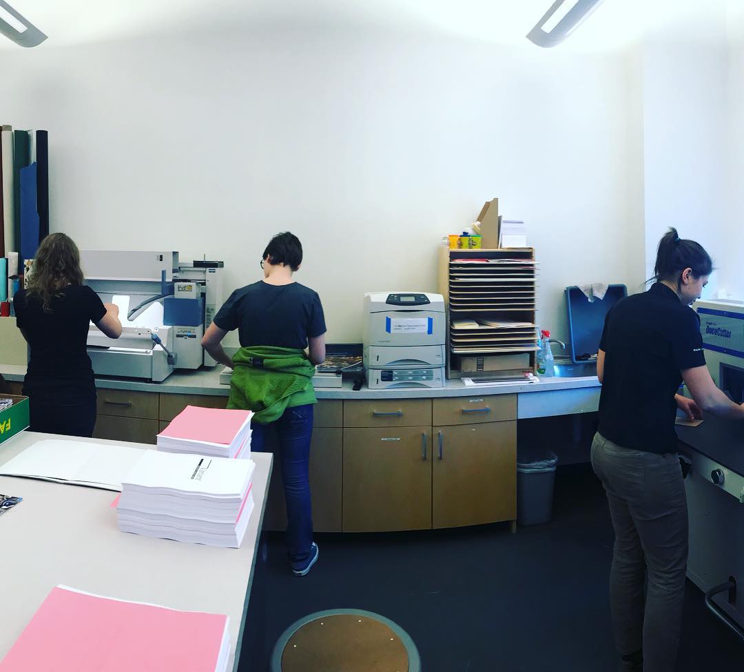
This photograph was borrowed from the Instagram account of Prof. Lisa Bickmore. This was our first day of production for the SLCC community Anthology.
Source:https://www.instagram.com/megastore/
|
My role in the production of the Anthology consisted of the task of organizing the sequence of the book in a thoughtful pattern, designing and producing a file for the book cover using one of the photographs submitted to us, and reading each and every piece of poetry and every short story, committing each one's characteristics and theme to memory so that I could better do justice unto the pieces. The sequencing and reading was a task allotted to each of us three students. While I solely produced the cover design, others were charged with the production of the introduction and the colophon content. Publications are a collaborative effort, and we were very lucky to have the resources that we did in pulling this off. In the binding room, we were like a well-oiled machine. In the sequencing effort, we were like critical anthropologists, analyzing the virtues of each work. |
The cover's design was a work in progress. We decided in conjunction to sequencing the submitted pieces that the title of the Anthology would be "Variant". It was discussed to make the cover very much like that of last years'; a straight black bar across the top of the cover page, with the text dipping down into the cover image. However, expounding upon the theme of Variant, I decided that the cover would look best with an alternatively diagonal crossbar of black with a parallel line connecting to the title. It is a callout to the first Anthology cover design in that respect, but unique to our own 2018 design.
My own contributions to the anthology itself included some artworks that I produced this year and last year. Considering that images were one of the things that were sorely missing from the submissions, it added more aesthetic quality to the Anthology content.
My own contributions to the anthology itself included some artworks that I produced this year and last year. Considering that images were one of the things that were sorely missing from the submissions, it added more aesthetic quality to the Anthology content.
Finally, the book blocks rolled in hot from the printers next door in the Applied Technology building. The teasing snowflakes undoubtedly whistled into the ears of Andrew and Prof. Bickmore as they wheeled them into the Academics and Administration building where our classes are held.
Of course, it was not so much of an ordeal as it was a process of binding each book. Some were discarded, those that were not up to our standard once bound, and were put into a box that read: "Lonely Orphans :(". Whoever drew that sad face made me empathize with poor, unsuitable copies of the anthology as being like little Oliver Twist or Tiny Tim.
Nonetheless, we got nearly 300 freshly bound copies of the Anthology ahead of schedule, and I am very pleased to say that I'll be attending the launch party on January 24th. We are all very excited, especially to meet the lovely artists and authors face to face whom whose work we became so familiar.
All in all, the Anthology was one of the funnest and loveliest projects of my academic career, and I very much look forward to this January when we can have our party.
“We read five words on the first page of a really good novel and we begin to forget that we are reading printed words on a page; we begin to see images.”
–John Gardner
The visceral stories of the people of the SLCC community, as well as their intimate works of art are ones that I will treasure in my heart, as well as occupy a hallowed space on my bookshelf. Always will there be a clean track in the dust where I have pulled it off the shelf to show my friends and family, and I am always grateful to my fellow classmates and Professor for all the friendship and help. Thank you so very much for that privilege.
ECONOMICS
Hi there! Economics was definitely the most challenging class of this semester. In all honesty, I couldn't manage not to be blindsided by most of my assignments. It was tough, and very humbling. I learned a lot about myself, and about how to be a stronger college student, even if it took what I consider failure to see those truths. I chalk it up to beginner's folly.
| copy_of_dolabella.pdf |
My final assignment was a presentation given to the class with a partner on the topic of one of our countries' many national historic park.
I had originally chosen to do Nicodemus National Historic park, but starting out felt pretty lonely, and I saw someone else was doing Lewis and Clark National Historic Park, which I happen to know a little bit about, so I asked to team up with her on that effort. From my perspective, it turned out great. I did most of the heavy lifting on the presenting, while my partner did most of the slides and design. Worked out very nicely.
I had originally chosen to do Nicodemus National Historic park, but starting out felt pretty lonely, and I saw someone else was doing Lewis and Clark National Historic Park, which I happen to know a little bit about, so I asked to team up with her on that effort. From my perspective, it turned out great. I did most of the heavy lifting on the presenting, while my partner did most of the slides and design. Worked out very nicely.
